frontend
design systems
a11y
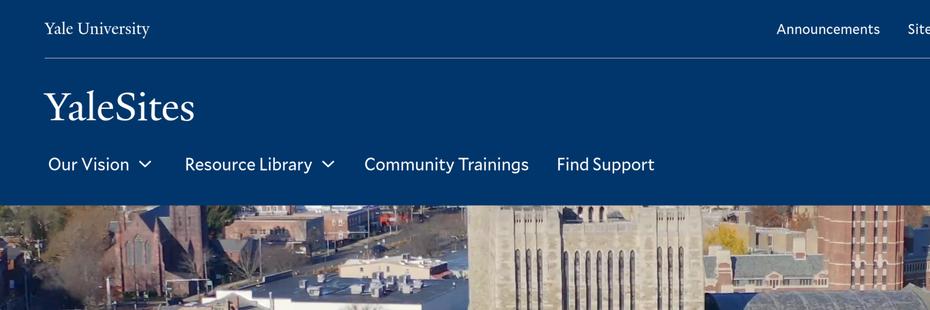
Yale University: YaleSites
While at Four Kitchens, I served as the lead front-end engineer on YaleSites from November 2022 through March 2025. My responsibilities included: architecting and authoring new components, wiring those components to Drupal templates, and implementing client feedback and accessibility feedback cycles.
Below, I have outlined some of my favorite components:
Grand Hero Video Component
- I architected and implemented this variation of the banner component.
- Live example in Drupal: YaleSites (first component under the header).
- Note: If you set your OS “Prefers Reduced Motion” setting to be enabled, the background video does not autoplay. It will also not autoplay if your browser is set to disallow autoplaying video.
- Can accept a static image or a background video.
- I implemented the background video option and have refined the static image one, but did not create the static image version.
- Code:
- Drupal Block Template
- Component
- Component CSS
- Includes Background Video Component, which I created.
- Background Video Component JS
Global and Component Theme System
- I architected and implemented a global theme and component theme system for the component library.
- The global theme allows for switching between different themes, which changes the CSS variables that are used across all components.
- The component theme allows for switching between different color schemes for individual components, which also changes the CSS variables that are used within those components.
- Live example in Storybook: Global Theme and Component Theme.
- You can think of it as a global theme being a collection of colors. The component theme allows you to use different color options made available via the global theme chosen. If you change the global theme, all of the component themes used throughout the site will have their color values change based on the new color “slots” provided by the global theme.
- We developed a system called “levers & dials”. Levers refer to big changes, such as a global theme change. Dials refer to smaller changes, such as a component theme change. Both levers and dials change CSS variables that are used across the site and within components.
- This system allows for a high degree of flexibility and customization while maintaining consistency across the site. It also allows for easy implementation of dark mode and other color scheme variations.
In This Section - Secondary Menu with JS Overflow Behaviors & Dropdown Menus
- I architected and created this component.
- Storybook Component: In This Section
- Note: When you resize your browser window, any overflowed items spill over into left/right navigable items.
- At mobile resolutions, the section menu collapses.
- This component adheres to a global and component theme system, which I architected and implemented.
- Code
Tile Item + Tiles Components
- I architected and created these components.
- Storybook Tile Item Live Link: Tile Item.
- Note: In the Storybook controls, you can change and see (in the bottom-most “playground” example) the following variations:
- Content
- Content Link
- Presentation Style
- Alignment
- Vertical Alignment
- Component Theme
- With Image - boolean
- With Animation - boolean (respects OS “Prefers Reduced Motion” setting)
- Number is visible if Presentation Style is set to Heading.
- Note: In the Storybook controls, you can change and see (in the bottom-most “playground” example) the following variations:
- Code:
- Storybook Tiles Live Link: Tiles.
- Note: In the Storybook controls, you can change and see the following variations passed to each tile item:
- Presentation Style
- Alignment
- Vertical Alignment
- With Image - boolean
- With Animation - boolean (respects OS “Prefers Reduced Motion” setting)
- Column Count
- Note: In the Storybook controls, you can change and see the following variations passed to each tile item:
- Code: